Building a static website (part 8: Web typography basics)

 08-OCT-2025, updated 15-OCT-2025
Last time, I looked at using a CSS reset and some other CSS related items, such as how you might look at centring the main content on the page. In this blog post, I wanted to explore some of Web typography basics. My intention is to look at the basic concepts, ideas and recommendations in this post and then in the next one, dive deeper into implementation details.
This is definitely one of those subjects that is more "guidance and recommendations" rather than "definitive rules", which can make it quite difficult, although that is why I'm diving into this, to some significant level of detail.
Naturally, there are a ton of references and guides available out there on the web. Out of the many I have looked at so far, I think the best overall is currently: Everything you need to know about website typography (with examples), which gives a pretty good overview of the concepts.
Concepts
Before diving into the details, I think it's worth at least trying to understand some of the basic concepts and ideas behind this subject. Certainly, it is worth exploring what typography in general actually is.
I quote from the Wikipedia article: Typography is the art and technique of arranging type to make written language legible, readable and appealing when displayed
. We can then by extension say that Web typography is essentially the same thing, but applied to webpages, which share some characteristics of typography in print and other media, but clearly present many unique challenges. I suppose it is all about presenting words on your pages in the best way possible for your and the users needs.
I would suggest that some of the unique challenges of the Web typography might be:
- There is no fixed medium or form factor. Unlike books and magazines, which often come in a fairly limited range of sizes, that is not the case for the web.
- The screens that people access web pages on can have wildly different resolutions, which can affect readability and so on.
- Users likely expect an experience that is very different from the static type in a typical book (such as a novel).
- Users are free to change a number of settings on their device, such as font size and screen contrast, which is not possible with traditional print media.
On the other hand, I think we should also bear in mind the advantages afforded to us.
- The dynamic nature of the web allows flexibility that is impossible in print.
- The flipside of users being able to change settings is that it enables a level of accessibility that may not be possible to match with other media. For example, this can range from a zoom factor on a webpage all the way to using a screen reader.
Basic typography definitions
Clearly, a great deal of typography is centred round the way words are presented on the page. Many of those are centred round the appearance of the actual characters, while others describe the wider context. Given this, I think it's worth talking about the way I understand some basic typography related definitions.
First of all, at a high level:
- Typeface (font family): this is the umbrella term for a series of fonts that are related by certain style characteristics chosen by the original designer. Style in this case refers to the overall look. These will be familiar to most people as a particular names associated with them, such as "Arial", "Helvetica" or "Times New Roman". The term font family I think is preferred when we talk about the web, but is essentially the same as typeface. We can see these names in font chooser drop downs in word processors for example.
- Font: a font family is made up of one or more fonts. In some cases, there might only be one font within a family, or there could be many. Typically, you have different fonts that represent specific styles. For example, "Arial" includes regular, italic and bold variants. This comes into play when we directly or indirectly specify that something should be displayed as italic text for example, which would then display that particular font variant. If such a variant doesn't exist, the browser will attempt to display something equivalent, with varying degrees of success.
Digging a little deeper, a font family will be based on the following types, with the first two being significantly in the majority for most cases:
- Serif: a font family that includes the decorative strokes that protrude from the main body of letters. A classic example of this is "Times New Roman".
- Sans serif: a font family that doesn't include the decorative strokes. A very common example of this is "Arial".
- Monospace: a font family where the characters are all the same width, which is commonly used in things like source code text editing and displaying that type of content.
- Cursive: font family that attempts to represent text in a handwriting style.
If we then think about the way to describe some other more detailed characteristics of the individual characters used in a particular font, we have the following, some of which are also illustrated in the subsequent diagram. Some of these are likely to be more useful than others when it comes to Web typography.

Note that I'm not trying to be 100% precise in the following definitions, because I think it is unnecessary to get too detailed, at least as far as my usage is concerned.
- Baseline: the line on which most characters sit, excluding the descenders that appear below certain characters.
- Cap height: the height of uppercase characters in the font.
- x-height: the height of a lowercase character above the baseline. As the name implies, this is typically the height of a 'x' character.
- Kerning: the space between certain specific combinations of letters that can otherwise cause problems when placed together, such as 'TT' or 'WA'.
- Tracking: the space between individual characters.
- Leading: the space between lines of text, measured from baseline to baseline.
- White space: a more general concept, describing empty space between letters, lines of text, but also around such things as headings and paragraphs.
Although web typography is a lot more than which font to use, it is clear that font families and specific fonts are a core concept. Actually choosing a specific font is quite a vexed subject, because there is a very wide range of choices available, depending on the various circumstances involved. I will go into that subject more specifically in my next blog post.
I will continue by going through some of the various recommendations that I have collected while looking into this subject.
Web typography recommendations
As to be expected, there is a mountain of advice available, with "rules" and recommendations for effective web typography. One could (perhaps ironically) write a book on the subject, which I would rather avoid, so I am going to bring together some of the common areas for recommendation, relatively briefly. I will also make a few comments on what I think.
It is worth bearing in mind that the recommendations are mainly intended to enhance the most important goals of typography, which are: legibility, readability and accessibility. Briefly, these are:
- Invest in a design system
- Establish a visual hierarchy
- Choose a suitable font family
- Set min/max line length
- Choose font sizes
- Consider line height and letter spacing
- Consider the use of white space
- Miscellaneous recommendations
Invest in a design system
I thought that the tip about investing in the design system was interesting, because I haven't seen that mentioned elsewhere. I quite like the idea of having something that provides a set of standards to work from, especially having been used to large corporate environments, but as an individual, that is presumably something that you would have to build yourself — which is perhaps what this series of blog posts is all about to some extent.
Establish a visual hierarchy
I understand that implementing a visual hierarchy involves using different font sizes, weights and styles to guide the user towards what's important and to break up the text into easily definable sections. A straightforward example of that is using large bold text to represent a page heading, with normal body text significantly smaller, while other less significant text may be rendered in further smaller size, or possibly at a lighter font weight.
There is a lot of talk about how users tend to skim webpages, so this needs to be made easy for a user.
Choose a suitable font family
On the face of it, this does seem to be one of the most important considerations and some of the considerations I have seen include:
- Consider your "brand identity".
- Decide whether a serif or Sans serif font is most appropriate.
- It seems that using a Sans serif font for body text is favoured, possibly because of its legibility at smaller sizes on screens.
- Avoid using more than two or three font families.
- Where more than one font family is used, consider the font pairing and how it will look.
- Consider using variants from the same font family.
- It is not necessarily wrong to use the commonly available fonts as their are good reasons why they are commonly used.
Set min/max line length
It is very commonly advised that text should be restricted within a certain minimum and maximum number of characters per line (including spaces). The idea is that beyond a certain number of characters, it becomes increasingly difficult for your eyes to track successfully from line to line. Below a certain minimum, it is difficult because you are forced to constantly be moving down to the next line of text. Note that the recommendation does vary somewhat, with ranges from around 45-80 characters per line.
Personally, I agree that this is a good idea in principle, but I would also note that many of the sites that recommend certain maximums, often don't seem to stick to their own advice, with line lengths often being 90 characters per line or over. In my case, I tend to find that it is the physical on-screen length of a line that is most important, rather than the number of characters, assuming that the individual character readability is okay. Clearly, there is a significant relationship between the number of characters per line and the font size that you use.
Choose font sizes
When it comes to font sizes, there is some very specific advice, while other advice is more generic.
One generic piece of advice was to use a maximum of four sizes, which is defined as:
- Header font size [would there not be a multiple of these?]
- Default font size (presumably meaning body text).
- Secondary font size (2px smaller — for less important details of site).
- Tertiary/caption/label/wildcard font size.
As I noted above, I'm not sure whether it makes sense to talk about a single header font size, because clearly there can be up to 6 sizes of header.
Again from the The Responsive Website Font Size Guidelines, is an example of more specific advice, regarding font sizes for mobile and desktop use. For convenience, I reproduce some of that advice here.
| Element | Mobile | Desktop |
|---|---|---|
| Page title | 28-40px | 35-50px |
| Default/body text | 16-20px for text-heavy pages | 18-24px for text-heavy pages |
| Secondary text, captions | 2px smaller than default | 2px smaller than default |
I think it's also worth noting that browsers typically define a default font size of 16 pixels, so it may well be that leaving the body text at that size might not be such a bad idea.
Personally, I often find that the font sizes used on websites appears to be significantly larger than I would like and I find myself zooming out from the page. However, it is probably more important to think about the people who will read your website and what they may need.
Consider line height and letter spacing
There seems to be general consensus that the line height of the text (which is the distance between one baseline and the next), should be around 1.5 times the font height. I think this is typically the default value set by browsers. I have also seen a recommendation that line height should be reduced somewhat for headings, for those situations where they do end up wrapping round. Note that there are W3C recommendations that line height should be a minimum of 1.5 times the font size.
When it comes to letter spacing (tracking), there is just advice that this can alter the text density, as it will change the amount of white space between individual characters. I don't think I'm likely to go down to that level of detail right now.
Consider the use of white space
I think of whitespace being the generic term for everything on the web page that forms the background to the text that is displayed. I presume the name comes from the fact that backgrounds are typically white in colour, so that's what shows through. From a web typography point of view, we are talking about the space between lines and letters and between paragraphs, headers and so on. Altering properties such as line height and letter spacing (tracking) introduces more or less whitespace. These values can be changed so the page is more or less 'airy'.
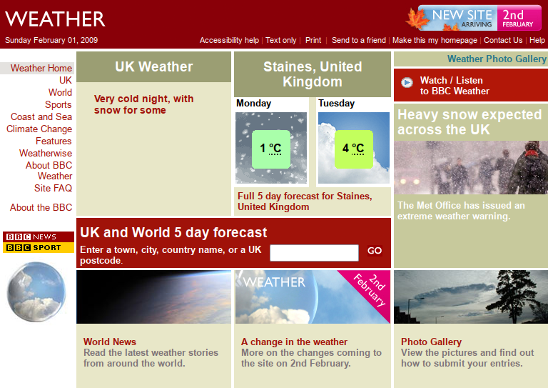
It seems that the trend has definitely been towards using more whitespace in modern webpages, in comparison with, say 15 or 20 years ago. I recall that this was particularly evident with high-profile redesigns such as that for BBC News in 2008. At the time, the then dramatic change in the use of things such as increased whitespace was highly controversial. Although to be fair, it is often extremely difficult to get people to praise any kind of change! As an example of how whitespace was used, take a look at the screenshot below of the BBC weather website, just before its redesign.
Now I think it is generally much more accepted for webpages to not be be highly compact things that they were back in those days.
Miscellaneous recommendations
There are plenty of other things that are recommended, but I thought I would collect a few more of these together under the "miscellaneous" heading.
- Text alignment. Text should generally be left aligned. Justified text doesn't really look good outside printed books and right and centre alignment just looks odd.
- Test your typography. Try to assess the look of the chosen typography on as wide a range of real devices as possible.
- Italic and bold text. Use italic and bold text appropriately for emphasis, which can include the name of creative works, such as The Sound of Music. Note: technically, we should probably be referring to emphasis and strong emphasis, rather than italic and bold, because we want to think from a logical property point of view, but the idea is the same.
- Avoid Lorum Ipsum. Instead of using the classic dummy text, it would be better to use either something that directly relates to the project in hand, or some other meaningful text.
Styling tables
Although this is not the main focus of this blog post, I decided I would add some basic styling for the <table> element, because up to now, there hasn't been any. I will no doubt return to this at some future point, but for now, the CSS I'm using is:
table thead tr
{
   background-color: lightgrey;
   border: 1px solid #ffff;
}

table, th, td
{
   border: 1px solid black;
   border-collapse: collapse;
}
The rendering of which can be seen in the recommended font size table earlier in the article.
Conclusions and design decisions
As usual, having looked into the subject, I need to think about what I should take from this as far as the design of my own website is concerned. Some of this can be seen in this current blog post page. Taking a few of the concepts that I explained earlier, I would say:
- Establish a visual hierarchy. I'm currently attempting this in a very straightforward way, by using headings to clearly indicate where we have separate sections. I'm also sticking to the idea of having a single
<h1>heading on the page, with a slightly different colour, then using<h2>and<h3>headings as appropriate. I'm currently using 3.0, 2.5 and 2.0 times the base font size respectively for those headings. - Choose a suitable font family. As I intend to look at this in more detail in my next blog post, I have just left the font family as the default set by the browser.
- Set min/max line length. As I have not changed anything regarding the default body font size, the line length is currently significantly greater than many sites recommend. I will likely come back to that later. Personally, I quite like having more characters on a line, but will think about this and more in the future.
- Choose font sizes. Apart from the heading font sizes as discussed earlier, I'm leaving everything else as default for the moment.
- Consider line height and letter spacing. I have left this as the current default for body text, although I have reduced the line height for the page heading. It's currently set to 110%.
- Consider the use of white space. I have essentially left this the same as in previous blog posts.
- Miscellaneous recommendations. I am using the default text alignment (left justified). I can't see a reason to change that. I'm also trying to use emphasis and strong emphasis, where appropriate. Finally, I don't need to use Lorum Ipsum text, because the text in my blog posts is my test text material.
Next time, I will be looking into the details of how to implement font choices using CSS, while making some initial choices for what fonts to use in my own blog posts.s