Web typography — more about fonts
Building a static website: part 9

 15-OCT-2025, updated 17-NOV-2025
Last time, I looked at Web typography basics, which included a discussion of fonts and font families from a general concepts point of view, without getting into many of the specifics. In this blog post, I want to look into more details about:
- Actually choosing a particular font family and more about the factors that might influence that decision.
- Exploring the different ways to implement those choices through CSS.
Font choices
Note that in this article, I will generally refer to "fonts", where this is often a shorthand alias for "font family".
I think it would be fair to say that there are a lot of available fonts, at least in theory. From this, the designer is expected to make some suitable choices for their website. I think that in order to get a better understanding of this, it is worth looking at the broad categories of fonts that are available and some reasons why (or why not) it might be a good idea to use them. Personally, I feel that you can divide these categories into the following, which I will then discuss in more detail. Then, in subsequent sections, I will look into the CSS that is required.
- Browser default fonts
- Web safe fonts
- System fonts
- Downloadable fonts/web fonts
Browser default fonts
I think it's worth briefly talking about the default fonts that a browser (user agent) will use either in the case of no fonts being specified by the designer or where the fonts specified are not available on the platform. After all, one legitimate way of choosing a font is to just leave it up to the browser to decide!
I can't speak for every browser, but if you take this specific example of Firefox, the browser specifies an overall default font, which in the case of Firefox running on Fedora Linux (my current main OS of choice), is "Bitstream Vera Serif", with a size of 16 pixels. In the case of Firefox (and likely other browsers), there is an advanced font settings page, which shows the defaults for other classes of fonts (such as the default sans serif font). On Firefox, this looks like the following:
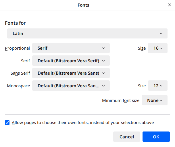
My assumption is that if no fonts are specified in a style sheet, then these are the ones that will be used. It's also worth noting that the user can tell the browser not to allow the override of those defaults (by CSS presumably). I presume if for some reason a user does tick that box, all the things about choosing the right font are no longer of any relevance. I expect this is relatively unusual, but the user does have that power.
As far as I understand, it is almost a universal standard for the default font size to be 16 pixels, with the default monospace font usually being a bit smaller (12 pixels in this case). Those are of course CSS (or logical) pixels, as I discussed in an earlier blog post.
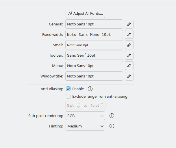
One thing that might be worth noting is that the default browser font settings appear to be unrelated to the underlying operating system defaults, at least in this case and also seemingly on Windows 11. That can be seen from the KDE Plasma desktop font settings panel (which is my desktop of choice):
I mention this, just because this implies that if this is similar for other browsers, it shows that it is more difficult than it would otherwise be to set webpage fonts to be the same as the operating system default fonts, if that was desired by the user.
As a final aside, while I was looking into this, I came away somewhat amazed by what appears to be the huge difficulty that you face setting the operating system default fonts on Windows 11. I had expected it to be really easy, but apparently not! Mind you, when it comes to macOS, it appears even more difficult.
Web safe fonts
Putting aside for a moment the difficulties of choosing a particular font, for whatever style reasons you might have, there is the difficulty of knowing what fonts might be available on whatever system the user is viewing the web page on. Although there are potential solutions that I will come to presently, it really isn't easy (or necessarily possible) to know the answer to that when you are designing. It's fairly obvious why that might be a problem, given that there are several major platforms and several minor platforms, all of which may well have fonts that are unique to that platform. I.e., we have Windows, macOS, iOS, Android and multiple Linux distributions. That's before we even think about web browsers on TVs and so on.
However, due to the semi-ubiquity of some fonts, there is a generally accepted list of web safe fonts – i.e. fonts that are almost guaranteed to exist on the platform the user is using. Perhaps the most recognisable of those would be "Arial" (sans-serif) and "Times New Roman" (serif).
If one (or more) of those fonts is acceptable to the designer, then the issue is largely solved, although it would be wise to bear in mind that although they are very likely to exist on a particular platform, there is no guarantee. For example, many of the fonts mentioned in the list linked above don't exist on many Linux distributions, such as Fedora Linux (which is my particular platform of choice). A user can install most or all of these without too much difficulty, but the majority of people will not. Indeed, in the article Is there such a thing as a web-safe font? and Fonts in HTML emails, it is argued that there really isn't any, particularly on platforms such as Android.
System fonts
In the previous section, I discussed the idea of web safe fonts, which are fonts that are very likely to exist on the user's system. Therefore, in the sense that such fonts are already installed on the user's system, you might be able to regard them as system fonts. However, I think a system font is regarded as a different concept. This is when a web designer wants to display their pages in one or more fonts that reflect those used on the specific platform that the user is viewing the web page on, whether that be macOS, Windows, Android or so on. It is quite conceivable that a default system font might be one of the web safe fonts we have talked about, but that would just be a coincidence.
It might also be worth exploring why the use of system fonts might be favoured to some web designers. From my point of view, I would say that:
- In general, as system fonts already exist by definition on a user's system, there is no overhead, in terms of performance. This will minimise page load times and bandwidth. That can still be an important consideration.
- If you want to make your website blend in to some extent with the particular platform that the user might be viewing it on, there might be no reasonable alternative to using some kind of system available font. There are downloadable fonts, which I will talk about, but you can't (legally) use that for certain fonts that might exist specifically for something like macOS.
Font fallbacks
In principle, a designer can specify one or more system fonts that they would like the text on their webpages to be displayed in. If at least one of those fonts is indeed available, then the browser should use that font. The problem is that none of the specified fonts might be installed on the users system, so the designer must be careful to specify one or more fallbacks. As far as I understand, if none of the system fonts are available and no fallbacks are specified, then the browser will have its own set of defaults that will be used (which is the same as if no fonts are specified by the designer). I discussed browser default fonts earlier in this article.
Downloadable fonts/web fonts
Note that I've seen the term "downloadable fonts" and "web fonts" (as opposed to "web safe fonts") used interchangeably. I'm going to refer to "downloadable fonts", which will hopefully avoid confusion.
Presumably in an attempt to get round the significant issue of many platforms not having the desired fonts installed, methods were designed to get round this problem by allowing fonts to the either installed on the website's own server, or be available from some third party and then be downloaded as necessary when a user visits the web page.
It seems fairly clear what the potential advantages are: complete control of what fonts are used to display on a web page, so allowing a designer to have confidence that they can achieve the exact look that they want, what ever the users platform (assuming a user has not overridden the ability for a webpage to set its own fonts). As there are a huge number of available fonts for this purpose, this would seem to allow a huge degree of flexibility.
On the other hand, there are some disadvantages or at least reasons not to go down that route:
- A designer may specifically want to try and display webpages in a font similar to or the same as what the user can see in other operating system installed applications.
- There is at least some overhead to using this approach, because the user may have to download one or more fonts when they access the web page, at least for the first time, after which presumably these font files are cached on the user's system.
- The enormous potential choice could lead to difficulty in decision-making — especially when so many fonts are at least to my eyes, rather similar. Maybe that's just due to my current lack of experience.
Implementing font choices using CSS
Having talked about some of the basic concepts in the earlier sections, I now want to talk about how fonts are specified using CSS.
The general way of specifying font family/typeface a.k.a. font, is to use the font-family CSS property. This allows one or more font families to be listed, with the first one taking priority. For example, if you were just interested in specifying Arial as the font for the <body> HTML element, you can specify:
body
{
   font-family: Arial;
}
The effect of this would be for text on the web page to be displayed in the Arial font family, unless that font was not available on the user's system, in which case, the text would be displayed in whatever the browser's default font is. As Arial is a very common font, most likely it will be available on the user's system. Note that I have set Arial as the font just for this particular paragraph, to help illustrate.
Putting aside the downloadable fonts for a moment, attempting to implement the designer's choice of "web safe fonts" or "system fonts" is seemingly a matter of specifying the appropriate list of fonts to achieve the desired outcome. However, that's where it can all be confusing and/or complicated.
Fallback fonts and font stacks
One thing to note is that normally, you would always specify one or more "fallback" fonts. The point of this is that, if the specific font choices you want and not available on the platform, then you indicate to the browser that it should use some other alternatives that you list. For example, if you would like to use the Arial font, you might have a fallback of Helvetica. Typically, you would also list one of the generic fonts, such as "sans-serif" or "serif", depending on what is required (Arial is a serif font). As noted earlier, if no alternatives are specified, then the browser will use what ever default it has available, which I suppose might either be a serif or songs at serif font. Note that when you specify a list of fonts in this way, it is often referred to as a "font stack", for fairly obvious reasons. We can see this in action below:
body
{
   font-family:
      Arial, Helvetica,
      sans-serif; /* Arial and Helvetica are sans serif fonts */
}
Web safe fonts
As a reminder, web safe fonts are fonts that are very commonly installed on a wide range of platforms. If the designer is happy with just one or more of those, then it is relatively straightforward. For example, if we are interested in serif font style, then we could conceivably specify something like the following. Note that we are a final fallback font of "serif":
body
{
   font-family: "Times New Roman", Georgia, Garamond, serif;
}
I do note that, depending on where you look, you might find that the list of fonts that is considered to be "web safe", might be quite long. For example The 23 Best Web-Safe HTML & CSS Fonts. I would observe that quite a few of those 23 fonts are not available on my particular OS of choice, but I presume they are commonly available (that website doesn't specify how they chose the list).
System fonts
As I covered earlier, what I mean by system font is the default font set by the operating system (as opposed to the browser). The idea is that it might be good to make your web page fit in with the general look of the operating system platform you are running on. Whether or not this is a good idea is a different thing.
It seems that setting such a system font is actually rather more complicated potentially than you might think, because "serif" and "sans-serif" are browser defaults, not operating system defaults. There is more than one approach to specifying a system font through CSS, some of which are browser dependent. I will explore more of this below.
The main approach to specifying system fonts is using an appropriate font stack, which can at least get close to supporting the native desktop operating system fonts, by listing those likely to be used on a particular system. Hence we can (crudely at least) target various platforms. This can be tricky, because we are not directly specifying the platforms of choice.
In a sense, this is very similar to specifying one or more web safe fonts, as we covered earlier, but with different font choices in mind. As a specific example, consider the following, which is very much influenced by my favourite platform of choice (Linux):
body
{
   font-family:
       "Noto Sans", /* modern KDE plasma desktop */
       "Oxygen-Sans", /* Old KDE plasma desktop */
       Ubuntu, /* Ubuntu, Linux Mint Cinnamon */
       Roboto, Helvetica, Arial, /* other platforms */
       sans-serif; /* browser default sans serif font */
}
Naturally, one can extend or change this list to support different choices of fonts that will be particularly relevant to Windows, macOS and Android for example.
Of course, one important thing to note is that there is nothing here that guarantees in any way that the font that will be displayed on a user's screen in the browser will actually be the one that they have set at the operating system level, because changing that (assuming it's possible), wouldn't then have any effect. In addition, over time, defaults have a tendency to change, which can make any existing list outdated.
Using system-ui (and related) for system fonts
Having covered the idea of font stacks to deal with system fonts, it seems there is also another couple of approaches that seemed to be potentially both significantly more straightforward and closer to supporting what a user has actually chosen at the operating system level. The first of these is seemingly the most straightforward: the use of the system-ui CSS property.
It seems that this was introduced, seemingly to solve the very problem of specifying that the operating system default font should be used on a web page. As far as I can understand, this can be a straightforward as (continuing the example of setting it for the <body> HTML tag):
body
{
   font-family: system-ui;
}
That appears to work by setting the font to be the default for the operating system that the browser is installed on. As I commented earlier in this post, it's surprising (to me) how difficult it is to set the default font on certain desktops, including Windows and especially macOS, but I was able to confirm that this does indeed work, at least with Firefox running on Fedora Linux (KDE). If you use the desktop font settings dialogue shown in screenshot earlier, to change the "General:" font, that is reflected in what is then displayed on the webpage. Nonetheless, whether it is difficult or not to change the default fonts on your desktop, this approach should work as expected.
Fortunately, the Can I use website seemed to show good support across all the major browsers.
In addition to this, there also appears to be other similar CSS font family values: ui-serif, ui-sans-serif, ui-rounded and ui-monospace. These should act in the way that you might expect, by setting the operating system default fonts for the serif, Sans serif, rounded and monospace fonts. However, in this case, the Can I use site seems to show that these properties are not supported currently, in anything other than Safari.
Using "font: menu" for system fonts
body
{
   font-family: menu;
}
Note that the previous paragraph should be rendered in what ever the default font is for menus on your system.
I would just say that implementing the ability to choose the default menu font seems like a somewhat quirky choice and I don't know what the reasoning behind doing this was.
Downloadable fonts (Web fonts)
Finally, we come to the technique that is the most flexible and appears to give you the most control over the appearance of your webpages: downloadable fonts (a.k.a. Web fonts).
In principle, the idea is straightforward. Instead of attempting to rely on fonts that might already be installed on a user's system, one or more special font definition files are hosted, either on the web server that serves the webpages, or from some other external web server. Theoretically, this means that a web designer will be able to use any font that is available to be served in this way and thereby provide any look that fits in with their particular website.
As I discussed earlier, this certainly appears to be a very good option to use, although to reiterate, it does have some potential issues:
- The overhead of having the user download fonts from the web server might be significant, depending on the exact circumstances, although I presume the files will be cached, so that overhead won't appear if the user comes back to the site.
- Although there are some websites that offer freely downloadable fonts, there may be a restricted range available and many of them don't seem to have the necessary file format available. Other sites might offer a wider range, but many of these may require licensing costs.
This blog post isn't designed to be a detailed tutorial, so I would recommend readers searching for something suitable if they want to know the details, such as CSS Custom Fonts, which is a very brief introduction or perhaps Web Typography, which is one of the chapters from the generally superb tutorial series, for a more guided introduction.
In order to try this out myself, I decided to download and use the Cormorant font from Font Squirrel.
Note that I decided to use this, because I wanted something fairly distinctive, rather than one that will necessarily blend in with the kind of website I am designing.
After downloading and unzipping the appropriate files (which are downloaded from the "Webfont Kit" tab), you then have to set up some suitable @font-face definitions, in order to reference those files. In my case, this looks like the following, which uses three definitions to provide a regular, italic and bold version. This paragraph should appear with that font.
@font-face
{
   font-family: "Cormorant";
   src: url("fonts/cormorant-fontfacekit/web fonts/cormorant_regular_macroman/Cormorant-Regular-webfont.woff")
        format('woff');
   font-style: normal;
   font-weight: 300;
}

@font-face
{
   font-family: "Cormorant";
   src: url("fonts/cormorant-fontfacekit/web fonts/cormorant_italic_macroman/Cormorant-Italic-webfont.woff")
        format('woff');
   font-style: italic;
   font-weight: 300;
}

@font-face
{
   font-family: "Cormorant";
   src: url("fonts/cormorant-fontfacekit/web fonts/cormorantsc_bold_macroman/CormorantSC-Bold-webfont.woff")
        format('woff');
   font-style: normal;
   font-weight: 700;
}
Note how we are defining a single font-family, but are then using different values for font-style and font-weight, in order to allow matching with the appropriate font files. This allows us to specify our fonts in the normal way later in the CSS.
Some extra CSS
As I go through these blog posts, along with the main topic, I also sometimes experiment with adding some further CSS that I think is useful or necessary. As always, the actual styles may not end up being exactly the same in the final design, but it is useful to at least try out some things, which is a major part of what this series is all about.
Styling code blocks
I've been presenting blocks of code (mainly CSS) throughout the series so far, but beyond the fact that they are monospace text, there is nothing to distinguish them and there is also the problem of where long lines overlap the available screen width. In order to get round that problem, I've now added the following CSS to the stylesheet for this blog post.
pre.code_block
{
   background-color: lightgrey;
   border: thin solid black;
   overflow: auto;
}
Adapting the main title for narrower screens
The blog posts so far have had a long main title, for example the previous "Building a static website (part 8: Web typography basics)". That is all very well, especially if you are viewing it on a large screen. However, viewing this on something with a narrow screen, such as a mobile phone, you end up with a main title that is so large that it can start pushing the main content off the screen, which isn't ideal. I decided to try and deal with that in a couple of ways:
- Divide the main title into two pieces, one of which is the main title for the particular post and the other which is a sort of subheading, which tells you which part of the series you are looking at. In this case, the main title will now be "Web typography — more about fonts", while the subheading is "Building a static website: part 9".
- For narrower screens, I wanted to hide the subheading and reduce the size of the main title, because even when it is shorter, it can end up taking an extra line of text.
To achieve this, I:
- Split that title, leaving the main part as the usual
<h1 class="main_title">, while adding a subheading as<h2>. - Added a
<div class="main_title_block">round of the whole thing, so I could set up some appropriate styles.
The relevant CSS to support this is:
@media (max-width: 450px)
{
   .main_title_block h2
   {
      display: none;
   }

   .main_title_block h1
   {
      font-size: 2.0rem;
   }
}
You can see this in action, either by viewing it on a suitably narrow device screen, or by resizing your browser window.
Conclusions and design decisions
Having looked at fonts and some of the mechanisms behind implementing those, I now have to think about what this means for my own website design. Are there particular font family and font choices that I feel I can make now, or is this something to leave to another time?
I have already mentioned a couple of decisions in the previous section. To reiterate:
- Styling code blocks
- Adapting the main title for narrower screens
In addition to those, at least for now I decided to try out the following:
- I am now using the following to set the base font:
font-family: "Noto Sans", "Oxygen-Sans", Ubuntu, "Segoe UI", Roboto, Helvetica, Arial, sans-serif;. I suspect I will be experimenting further with font settings before the design process is finished. - I thought I would go with
font-size: 110%;, which nods in the direction of a slightly larger font size and thereby reduced line size. As I have commented elsewhere in this post, I tend to prefer a somewhat smaller font size than a lot of websites use, but I thought it would be interesting to make it at least a bit larger. - I have chosen to go with serif fonts for headings, to contrast those with the sans serif fonts used for the main body text. But the moment, I'm using
font-family: "Noto Serif", "Times New Roman", Georgia, serif;to achieve this. I'm not convinced I will stay with serif fonts, but I will keep trying them out for now.
As implied by what I have been discussing, I have taken the current design decision that I will stick with non-downloadable fonts, at least for now. I'm going to see what I can get out of fonts that are either system fonts on various platforms or are at least commonly installed.
In the next post, I will look at adding a table of contents.