Building a static website (part 2: Introduction to images)
In the first article, I described the very basics of the static website I am designing and documenting through these blog posts. That first blog post contained only text, with no images of any kind. Whereas in this does make for a very fast website, the inclusion of images (and other media such as videos) is practically essential for anything but the most basic website. I certainly intended to include images in my website, so I need to consider how this should be done and how it may vary depending on the different circumstances that we might encounter.
The first thing to say is that images can be a total pain. There are all sorts of issues of the lead up to this opinion, including:
- Bitmap mages have a fixed (intrinsic) size and aspect ratio, which can put them at odds with many of the browsers and devices that you might wish to view a web page on.
- The previous point means that it is difficult to resize images on the fly, which is not the case for things like text on a website.
- Image file sizes can be very large, especially as we increase the resolution of that image. This can be a significant problem when people are viewing images on a metered and/or slow connection, which is still very common for mobile phones.
In this blog post, I want to consider some of the basics of how to include images in the webpages on this site.
Simple embedding of images
Anyone who has at least a passing familiarity with HTML markup knows that just including an image in a web page is very straightforward and we can see that from the following PNG image, which shows an outline of the famous Battersea Power Station. It has a width of 1500 pixels and has a file size of about 50 kB.

The HTML markup for that is as follows:
<p><img src="images/battersea_power_station_outline.png"
        alt="An outline image of Battersea Power Station."></p>
There is one important thing to note straight away. As the image has an intrinsic width of 1500 pixels, if the width of the browser viewport (the width of the content area) is less than that width, it would require the user to scroll sideways, unless something is done to constrain the image within the window. As this is often desirable, and immediate way to achieve this is to add the following to the CSS file:
img
{
   max-inline-size: 100%;
   block-size: auto;
}
This means that as we resize the browser window, the image will be resized to fit inside that window, until it becomes wider than the intrinsic width of the image (which is 1500 pixels), at which point the image will retain its full size. Note that we have, in the most basic sense, started to deal with the thorny subject of responsive images, although there is a lot more to talk about in that area.
Image formats
When embedding images in a web page, one has to consider what file format to use. This can be something of a complicated business, so in the section I want to go over some of the possibilities and come to a decision on what I will do for the specific site I'm building.
First of all, it would hardly be a surprise to mention that there are plenty of resources out there on the web that talk about exactly this kind of thing. One of those that looks particularly useful and comprehensive is the MDN Image file type and format guide. I will certainly not attempt to repeat the comprehensive level of information presented there, but I will share a few thoughts.
In summary, it would seem that the choice of image format is a compromise, that depends on factors such as:
- The type of image it is (such as photo, screenshot, diagram or icon).
- How big it is (both in terms of resolution and file size)
- The circumstances under which it will be viewed, such as desktop browser versus mobile device.
- What level of support it generally has in browsers.
There are a number of vary widely, or widely supported image formats that have various advantages and disadvantages in the areas mentioned above. Some like JPEG and PNG have been around forever, while other formats such as WebP and AVIF are considerably newer (and correspondingly have somewhat less browser support). From a very broad outline point of view, I think we can say that:
| Format | Best for |
|---|---|
| JPEG, WebP, AVIF | Detailed images |
| PNG | Screen shots and icons |
| SVG | Icons and diagrams |
One thing that is worth stating here is that from the perspective of this website, I'm necessarily concerned about having to support relatively old versions of browsers. This isn't meant to be some kind of commercial site that needs to worry about this kind of thing. In practical terms, this means I don't have to worry about using "fallback" image formats, should I choose to use one or more of the more modern formats (such as WebP and AVIF). If nothing else, this simplifies the situation (no need to use things like the <picture> HTML element, at least not for that purpose. On the other hand, if it's straightforward to provide some level of support for older or alternative browsers, then it's still worth considering.
My intention is to use, where that is possible, SVG for icons and diagrams — SVG has a relatively small file size and can theoretically be scaled to any size without loss of quality. PNG also seems a reasonable file format to use for screenshots as they tend to be relatively compressible images and frequently benefit from the lack of artefacts that come from compression.
This leaves the main design decision as deciding between JPEG, WebP and AVIF images to be used for things like photographs.
I thought it would be an interesting exercise to compare file sizes of a typical kind of image, converted to the different formats. That might lead to some conclusions about what image format to use. Therefore, I tried this on the following image, which was taken on an iPhone 11 pro and exported as a JPEG image, with a size of 4032x3024 and a file size of 3.3 MB. A reduced size version of that appears below.
Note that I used the magick command with default options to perform the resize/format conversion, at least for the JPEG and WebP file types. For reasons that I didn't have time to get to the bottom of, running that magick command line to convert to AVIF produced a file with the expected extension, but had seemingly left the actual contents of the file as JPEG data! This led me to use the avifenc command (again with default options) to perform that conversion.
| Image Width (px) | JPEG | WebP | AVIF |
|---|---|---|---|
| 100 | 8.2 K | 7.2 K | 5.4 K |
| 200 | 20 1K | 17 K | 9.7 K |
| 400 | 64 K | 52 K | 24 K |
| 800 | 223 K | 182 K | 74 K |
| 1200 | 472 K | 380 K | 160 K |
| 1600 | 796 K | 645 K | 256 K |
| 2500 | 1.8 M | 1.4 M | 500 K |
| 4032 | 3.4 M | 2.8 M | 911 K |
Admittedly, this is one image, processed through a couple of commandline tools without any further optimisation options, but the outcome is nonetheless very interesting. What stands out is how extraordinarily good the compression of AVIF images is in comparison with WebP and especially JPEG! In a quick test, I tried eyeballing the maximum size image, comparing the JPEG and AVIF results at 100% and I cannot see any difference. Amazing.
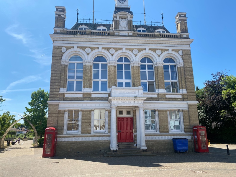
For interest, I present below the AVIF version of the town hall image included earlier. This is certainly a typical size that might be used on the web and if viewed at the full 800 pixel width on a reasonably sized screen, I wonder if anyone can spot a difference?

Oddly enough, this actually makes for an interesting decision about the image format to use. Based on file size alone, it looks as though AVIF knocks it out of the park. However, there are a couple of problems, which are as I outlined earlier, that at least need bearing in mind.
- The browser support for AVIF is good, but not universal. For a somewhat ironic example, the Seamonkey browser I often use for web development does not display AVIF images, at least on my Linux setup. I tried the same thing on a Windows machine and got the same result. I did some searching to see if there was an immediate solution, but I couldn't find anything, so that's interesting.
- Although there is some level of confusion, it would appear that AVIF does not support progressive rendering – i.e. the ability to start displaying an image before it is fully downloaded.
Now, it is fair to say that the number of Seamonkey users presumably represents less than a rounding error in the browser use statistics, but I personally find it very useful.
Right now, my immediate conclusion from the above is that I'm going to use WebP images for now, specifically for high-resolution bitmap images such as photographs. Certainly, it seems that WebP format images are significantly smaller than the equivalent JPEG and it also supports transparency and progressive rendering. Handily, WebP images also have good support in modern browsers and that's good enough for me.
It is worth remembering that there are potential ways of supporting AVIF for most situations and then having a fallback of WebP (or even JPEG), by using the <picture> HTML element, but I may return to that possibility after I have explored the basics of responsive images, because that element has a place in something like that. I may well return to the subject of image optimisation in a future blog post, because that seems like a potentially complex area.