A first look at CSS grid.
Building a static website: part 11

 14-JAN-2026, updated 18-FEB-2026
Table of Contents
In my previous blog post, I looked at the CSS flexbox technique, through the medium of implementing a list of currently published blog posts. This time round, I want to dive into the CSS grid layout system, because this is clearly an important topic when it comes to laying out HTML pages and is also pretty closely related to CSS flexbox, although it has different strengths that lend it towards different use cases, but doesn't invalidate the use of CSS flexbox for many situations. I suppose that's the same as CSS flexbox not completely removing the usefulness of CSS floats, as they can all be used together.
From a personal perspective, unlike CSS flexbox, I had essentially no experience of CSS grid before coming to write this blog post, so it is definitely a voyage of discovery.
1. An introduction to CSS grid
As usual, I want to throw in the caveat here that this isn't intended to be a CSS grid tutorial. There are of course a huge number of those available, so I won't pretend I can do a better job. One I would personally recommend is An Interactive Guide to CSS Grid, which is presented in a useful way. What I'm trying to reflect is the process that I went through in attempting to understand some of the concepts.
1.1 A bit of a mystery
Before going into the details of CSS grid, I wanted to share some behaviour that was initially completely inexplicable, which I came across while working on this blog post. It's something that I don't remember ever explicitly being mentioned anywhere that I had personally read, so I thought I would share it.


What you can see above are four images, each one 200 x 200 in size. Note that I've also added some CSS that puts a one pixel black border around the whole <div>. I was fully expecting that there would be no space between them, since the HTML that I'm using looks like the following:
<div class="normal_flow1">
   <img src="bp11/bp11_image_square_item1.svg" alt="item 1">
   <img src="bp11/bp11_image_square_item2.svg" alt="item 2">
   <img src="bp11/bp11_image_square_item3.svg" alt="item 3">
   <img src="bp11/bp11_image_square_item4.svg" alt="item 4">
</div>
However, as can be seen, there is a gap horizontally between the images and between the row of images and the bottom of the <div>. Despite everything I could think of, I could not explain what was going on. Eventually, I decided to use the Firefox Web Developer Tools (F12) To see if I could find anything. As can be seen from the following screenshot, you could see the display of something labelled as "whitespace".
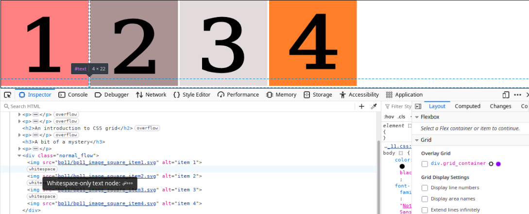
Bearing in mind that it's only recently that I've started using these tools, I didn't know what that meant, so did some searching and eventually found: "DevTools now display white space text nodes in the DOM inspector", which seemed to be the explanation. It seems that the new lines between the image declarations causes "anonymous text nodes" to be created, which is where the spacing is coming from.
Note that there is an MDN article "Handling whitespace" that goes into this in a great deal of detail. There is also a specific section of that article that appears to cover this scenario.
It gives a couple of possible solutions for what is happening. Because I found them interesting, I will mention both of them below.
Remove whitespace between images
If we leave everything else the same, but have all of the image declarations on a single line, without any spaces between them, the horizontal gaps disappear (because we've removed the whitespace that causes the issue). We can see that below. Note that we can still see a gap below the images, which I was still finding somewhat difficult to understand.
The HTML looks like the following:
<div class="normal_flow1">
   <img src="bp11/bp11_image_square_item1.svg" alt="item 1"><img src="bp11/bp11_image_square_item2.svg" alt="item 2"><img src="bp11/bp11_image_square_item3.svg" alt="item 3"><img src="bp11/bp11_image_square_item4.svg" alt="item 4">
</div>
Reduce the font size to 0.
Another solution given was to set font-size: 0;. It seems that because the whitespace problem is coming from text, by making the font size 0, you eliminate the problem. The result can be seen below. Note that the HTML now has the new lines between the image declarations, as we had originally. Despite that, there are no gaps between images, or below the images!
The CSS is:
.normal_flow2
{
   border: 1px solid black;
   font-size: 0;
}
Hopefully, there may be some people that will benefit from this detour away from the main subject.
1.2 Executive summary for CSS grid
I believe that CSS grid can be summarised by the following features:
- It is an advanced layout mechanism, sharing some features of CSS flexbox. Notably, we have the concept of a container and items.
- It is a two-dimensional layout technique, which compares to CSS flexbox, which is one-dimensional.
- Two-dimensional in this context means that both rows and columns are defined, either explicitly or automatically. The actual size depends on a number of factors.
- CSS grid includes the concepts of rows, columns, grid lines and grid tracks (similar to spreadsheet rows and columns).
- The child items of a grid container can be left to automatically be placed onto the defined grid.
- Grid lines and areas can be defined by name.
- Spare space in the grid container can be distributed between grid tracks.
- Grid items can be aligned within their areas.
- A new measurement unit was introduced the CSS grid:
fr, which is short for "fraction", which can be used alongside the existing ones, such as specific pixel values, percentages and so on.
1.3 CSS grid property summary
The following is a summary of the main properties associated with CSS grid, with their possible values (where relevant, the default value is highlighted). Note that where we have {value} or {name} in the Values column, what that represents can be complicated, so see later for more details. Anything between quotes is the literal value without the quotes.
| Property | Values (Default Highlighted) |
|---|---|
| display | grid | inline-grid |
| grid-template-columns | {value} | {name} |
| grid-template-rows | {value} | {name} |
| grid-template-areas | {name} | "." | none |
| column-gap | {value} |
| row-gap | {value} |
| gap | {row value} {column value} |
| justify-content | start | end | centre | stretch | space-around | space-between | space-evenly |
| align-content | start | end | centre | stretch | space-around | space-between | space-evenly |
| justify-items | start | end | center | stretch |
| align-items | start | end | center | stretch |
| grid-column | {value} |
| grid-row | {value} |
| grid-area | {name} |
| justify-self | start | end | center | stretch |
| align-self | start | end | center | stretch |
1.4 Grid container and container items
The basic concept of CSS grid is to define a number of rows and columns, onto which you then place the children of that container. There are of course all sorts of ways to define these and to control how those items are actually placed. The following diagram summarises some of the important concepts.

- The main thing is that we are defining areas into which we then place the content that we want to display.
- The overall grid is defined within a grid container (which I suppose is similar to the CSS flexbox container).
- Within the container, we then define grid rows and grid columns. In the diagram, there are six columns and three rows.
- The width and height of each row and column can be defined in a number of ways. The diagram illustrates how we can use an explicit size (such as 300 pixels) or lead some to be automatically defined. In this case, it shows this for the columns, but the same thing can be defined for the rows.
- There are grid lines associated with the grid that we define. These are represented by the vertical and horizontal numbered lines in the diagram. These are invisible, but are important as part of our CSS definitions. Note that there is one more line than there is column or row. In the diagram, there are six columns but seven vertical lines and three rows, but for horizontal lines.
- The space between the grid lines is a grid track, which of course can be both vertical and horizontal. These are roughly equivalent to the idea of a spreadsheet row and column.
- We are able to define both grid cells and grid areas, which can be used to lay out our content.
- It is not required that columns and rows are defined. If we don't do so, then this CSS grid algorithm will deal with that, although I imagine not a defining columns would be relatively unusual.
- Grid items are the child HTML elements that we want to actually display.
1.5 A first CSS grid example
We all have to start somewhere and the following is my attempt at a first example of using CSS grid, which demonstrates a few of the features.

Images have a fixed width, while this paragraph does not, so the text wraps depending on the available size.
The HTML is as follows:
<div class="grid1">
   <img src="bp11/bp11_image_square_item1.svg" alt="item 1">
   <img src="bp11/bp11_image_square_item2.svg" alt="item 2">
   <img src="bp11/bp11_image_square_item3.svg" alt="item 3">
   <img src="bp11/bp11_image_square_item4.svg" alt="item 4">
   <img src="bp11/bp11_image_square_item5.svg" alt="item 5">
   <p>Images have a fixed width, while this paragraph does not, so the text wraps depending on the available size.</p>
</div>
The CSS is:
.grid1
{
   display: grid;
   grid-template-columns: 1fr 1fr 1fr;
   border: 1px solid red;
}
The explanation of how this is being displayed is:
- We have defined the grid container to have three columns:
grid-template-columns: 1fr 1fr 1fr;. This means the available horizontal space is divided into three equal portions. - We have not specifically defined any grid rows, so these are added as necessary by the algorithm.
- As the images are a fixed width, they take up the first 200 pixels of each grid cell, so there will be space between them, as long as the browser window is wide enough to allow this. This also demonstrates that the default value for
justify-itemsisstart. - The paragraph of text is wrapped as appropriate, depending on how wide the grid column is.
- If the browser window is made increasingly narrow, eventually there will be no gaps between the items and they will overflow the browser viewport. Note that this may not occur on this specific page, because of the overall page layout that I have defined (see subsequent section).
1.6 Set the gap
Having discussed in some unexpected gaps appearing between images earlier on, I wanted to throw in an example of how we can easily set (deliberate) gaps between items, again in this case images, once again 200 x 200 pixels. We can see the result below. It is possible to use the column-gap, row-gap or the shorthand gap properties to set this.
In this case, the CSS is as follows:
.grid_gap
{
   display: grid;
   grid-template-columns: auto auto;
   justify-content: start;
   gap: 10px 15px; /* row gap, column gap */
   border: 1px solid red;
}
It's worth noting that the gap that is set only appears between the items, not round the outside. Also, I've set justify-content: start; so the images are displayed towards the left-hand side, rather than being spaced out as they otherwise would be.
1.7 Spanning across the tracks
Having looked at a couple of examples of where items are placed into individual grid cells, I wanted to look at how we can place certain items across multiple tracks, which is the sort of thing that helps to make CSS grid layout so powerful. In order to do that, I thought it might be interesting to try and create a layout that approximately reproduces the image at the top of this article. Something similar to this is often used in CSS grid tutorials, to give an idea of how CSS grid is often very useful for the overall layout of a web page.
As it happens, it turned out that this gave me an opportunity to illustrate how CSS flexbox can be used within a CSS grid layout, which begins to give an idea of where they have particular strengths.
The outcome is as can be seen below, which is reasonably close.
Header Area
Aside
Main Content Area
The very straightforward HTML is shown below. I guess this once again shows the power of CSS to transform some really basic HTML markup into something visually very distinctive and powerful.
<div class="page_layout">

<div class="header">
   <p>Header Area</p>
</div>
<div class="aside">
   <p>Aside</p>
</div>
<div class="content">
   <p>Main Content Area</p>
</div>
<div class="footer">
   <p>Footer Area</p>
</div>
<div class="sidebar">
   <p>Full Length Side-bar</p>
</div>

</div>
As usual, the magic is in the CSS. Let's go through that in some more detail.
.page_layout
{
   display: grid;
   grid-template-columns: repeat(5, 1fr);
   grid-template-rows: repeat(3, 200px);
   justify-content: center;
   border: 1px solid red;
   font-family: "Liberation Sans", Arial, sans-serif;
   font-size: 3rem;
   text-align: center;
}
- The
page_layoutclass is the grid container, so this is where we set the rows and columns for the grid. - The
grid-template-columns: repeat(5, 1fr);uses the "repeat" function to define five columns, using1frto leave the algorithm to distribute space between them. This is important, because it allows automatic resizing. If we have fixed column widths, this can lead to problems with overflowing. - The
grid-template-rows: repeat(3, 200px);again uses the repeat function, this time defining three rows, each a fixed size of 200 pixels. - The
font-family,font-sizeandtext-alignproperties are used to make the text match that of the diagram as far as possible.
.header_area
{
   background: #ff9966;
   grid-column: 1 / 5;
   grid-row: 1;
}

.aside
{
   background: #33cc66;
   grid-column: 1;
   grid-row: 2;
}

.content_area
{
   background: #198a8a;
   grid-column: 2 / 5;
   grid-row: 2;
}

.footer_area
{
   background: #cccc00;
   grid-column: 1 / 5;
   grid-row: 3;
}

.sidebar
{
   background: #ff6633;
   grid-column: 5;
   grid-row: 1 / 4;
}
In the above, alongside setting appropriate background colours to match that diagram, we use grid-column and grid-row to place each item in a specific area of the grid we defined earlier. Naturally, I fell for the "gotcha" regarding the values we use with those properties. For example, when we use the definition grid-row: 1 / 4;, the values represent the (invisible) grid lines that the item will appear between. There is one more grid line than the number of rows (and columns) we define. When I first tried this, I was using the values 1 / 3;, which meant the sidebar did not stretch across all three rows. I'm sure I'm not the only one to make this mistake!
.page_layout div
{
   display: flex;
   justify-content: center;
   align-items: center;
}

.page_layout p
{
   margin: 0;
}
The above shows how we can combine the use of CSS flexbox with CSS grid. In this case, we are making use of CSS flexbox behaviour to centre the text both vertically and horizontally. This is done by using display: flex; and then using justify-content: center; and align-items: center;.
2. Layout of a recipe webpage
In the previous section, I looked at the sort of generic example of how CSS grid could be used to lay out a web page at a high-level, presumably within which the rest of the items could be styled as necessary. Given this, I thought it would be interesting to try out the same thing on a closer to reality webpage — in this case, one for presenting recipes. As I am intending to include some recipes on the eventual website, this has further relevance.
To do this, I have put together a recipe for Sausage and Red Pepper Hotpot. We are not talking fine dining here, but the whole point is to just use it to try out some ideas. Also, I'm not particularly concerned about details such as fonts, because the focus is the overall layout and getting some idea of how we might be able to adapt that layout of the desktop and mobile (or is that the other way round these days?)
In order to get there, I'm going to consider the requirements step-by-step and see how that can be achieved. My plan is to start by presenting a cut down version of the final recipe page, designed to illustrate the main layout decisions and then add the CSS required, along with the usual comments.
2.1 Basic page layout
The first thing to consider is how the contents of a recipe page is divided up from a logical point of view, because these will become the areas that will be styled in the way that we require. In this case, I think this is as follows:
- Description: includes the title of the recipe, alongside a summary and basic information, such as how many people it serves.
- Main image: an image of the completed recipe.
- Ingredients: a list of the ingredients required for the recipe.
- Method: the steps required to complete the recipe.
- Recipe notes: extra notes about the recipe, including photographs of the ingredients, equipment and preparation steps.
From the point of view of HTML, we are going to use <div> elements to divide up the page content, surrounded by the semantic HTML element <article>. Finally, there is a <section> semantic HTML element that brings together everything, excluding the "recipe_notes":
<article class="recipe">

<section class="recipe_main">

<div class="description">
</div>

<div class="main_image">
</div>

<div class="ingredients">
</div>

<div class="method">
</div>

</section>

<div class="recipe_notes">
</div>

</article>
Basic example (mobile first)
In the first, basic version, there is a page with just basic CSS styling, including some borders and background colours, to make it easier to see where everything is. As the CSS includes the usual resetting of CSS margin and border to 0, I've also added some padding to the unordered and ordered list for the ingredients and methods sections, so we can actually see the list bullets. I have also temporarily removed the various icons that indicate cookery information, such as how many people it serves and so on, because I want to go back to adding those later.
I suppose you could describe this as mobile first design, because this basic layout, just using the normal HTML flow, is perfectly viewable on a mobile device, as well as working (albeit non-optimally) for desktop browsers. That's the magic of basic HTML I suppose.
Responsive grid layout for cookery notes section
Next, we introduce our first use of CSS grid, to provide a responsive layout for the cookery notes section. Note that I could have used CSS flexbox to produce a similar effect, but as I'm mainly looking at CSS grid in this blog post, it seemed appropriate to try this out. In addition, we are essentially presenting a list of similarly sized images (with some basic annotation using the <figure> HTML element), which seems to lend itself nicely to using this approach.
It is pleasing that this is possible by using a small amount of CSS, which is as follows:
.recipe_notes ul
{
   list-style-type: none;
   display: grid;
   grid-template-columns: repeat(auto-fill, minmax(300px, 1fr));
   row-gap: 10px;
}
Note that we are making use of the unordered list to be our grid container. The grid-template-columns: repeat(auto-fill, minmax(300px, 1fr)); line creates as many grid columns as we can fit within our grid container, each with a minimum width of 300 pixels. This means that as we resize the browser window, we will fit in more or less images on a single line (grid row). That means it will adapt automatically to the device we happen to be using. All done without media queries.
It might be worth mentioning that we haven't changed the HTML at all, other than to reference a different style sheet.
Using CSS grid to layout the other sections
For the next iteration, we use CSS grid, combined with a little bit of CSS flexbox to arrange the description, main image, ingredients and method sections a bit closer to how we want to see them. In this case, we use the technique that allows us to name the grid container items, using grid-area and then define the grid rows and columns with grid-template-areas. We use the following definitions for those names:
grid-area: description;grid-area: main-image;grid-area: ingredients;grid-area: method;
The following CSS is used to define the grid itself and that is enclosed in a media query, which enables the grid for viewport sizes over 600 pixels, which is once again a "mobile first" approach to the design.
@media (min-width: 600px)
{
   .recipe_main
   {
      display: grid;
      grid-template-columns: repeat(2, minmax(300px, 1fr));
      grid-template-areas:
         "description main-image"
         "ingredients method";
   }
}
We also use CSS flexbox to centre the main recipe image, by using the following:
.main_image
{
   ...
   ...
   display: flex;
   justify-content: center;
}
The addition of cookery information icons
Up to now, I haven't included the cookery information icons that appear in the finished version of the recipe page, which summarises how many people it serves, approximately how long it takes to cook, how easy (or difficult) it is and whether it can be frozen. Now, I've added those. Illustrating how CSS grid and CSS flexbox can work together, I added the following CSS to achieve this:
.description ul
{
   display: flex;
   list-style-type: none;
   gap: 10px;
}

.description img
{
   width: 60px;
}
Nothing too complicated there. We are using the unordered list as the flex container and using gap: 10px; to put a bit of space around the icons, while restricting the size of those icons with width: 60px;. This ensures that when we make the browser window narrower, we won't run into issues with the row of icons being too wide.
The difference between the above and the original Sausage and Red Pepper Hotpot is simply that I have removed the Borders and background colours that I was using to illustrate where some of the major elements on the page actually begin and end.
Clearly, there would be plenty more work to do if I wanted to turn this into a fully baked recipe page design (if you'll pardon the pun), but that's not the point of this exercise. Instead, I think I've managed to show some of the features of CSS grid and how it can also be combined with CSS flexbox. The result is that we have a flexible design that shows how it can work reasonably well on both mobile and desktop browsers.
3. Using CSS grid to lay out this blog post
Finally, having talked about the concept of using CSS grid for an overall page layout, I thought it would be interesting to try that out that this particular blog post. Nothing fancy, but it should give an indication of how this might work. The results can of course be seen by looking at this very web page. The overall goal is:
- On a wide browser window (at least 1200 pixels), we define three columns: a left sidebar, main content area and the right sidebar. Additionally, the header and footer areas span those three columns.
- On a narrower browser window (below 1200 pixels), we define one column, where we display the header, followed by the "left sidebar" (now displayed below the header), the main contents, the "right sidebar" (now displayed below the main content), followed by the footer area.
In terms of the HTML, I'm just adding something really simple, merely to illustrate the basic idea, so we have the following two items added to that HTML:
<div class="left_sidebar">
<p>On wide viewports, this will appear as a left sidebar. On a narrower screens, it will appear above the main article.</p>
</div>

<article>
...
...
</article>

<div class="right_sidebar">
<p>On wide viewports, this will appear as a right sidebar. On narrower screens, this will appear below the main article.</p>
</div>
In terms of the CSS, we can once again think about designing "mobile first", which means by default, the left and right sidebar is actually appear in their natural HTML order, until we actually apply some CSS to control them. To achieve this, we define some appropriate grid-area definitions, which will then use to set up the CSS grid layout.
header
{
   grid-area: header;
}

.left_sidebar
{
   grid-area: left-sidebar;
   background-color: palegoldenrod;
}

article
{
   grid-area: article;
}

.right_sidebar
{
   grid-area: right-sidebar;
   background-color: powderblue;
}

footer
{
   grid-area: footer;
}
The final piece is to use a media query controlled CSS grid layout, which switches to 3 columns when the browser window is 1200 pixels or wider.
@media (min-width: 1200px)
{
   .grid_container
   {
      display: grid;
      grid-template-columns: 200px minmax(800px, auto) 200px;
      grid-template-areas:
         "header header header"
         "left-sidebar article right-sidebar"
         "footer footer footer";
   }
}
We don't need to define anything for when the browser window is below 1200 pixels wide, because that is effectively the default.
4. Conclusions and design decisions
I have now looked at the basics of the CSS grid layout technique and demonstrated how it can be applied to some typical use cases, including this particular blog post web page and a prototype recipe page. I have also succeeded in combining elements from CSS flexbox with CSS grid, which can help illustrate where these techniques can both coincide and how they are different to each other.
I've also continued to think about how design can be considered from a "mobile first" perspective and how we can manipulate the HTML through CSS to provide differing experiences on wide screens.
There is of course an endless universe of possibilities when it comes to using something like CSS grid, so I feel as though I've just begun. There are also significant related topics, such as CSS sub grid, which is something I will look at potentially in a future blog post.
As far as the next blog post is concerned, I don't yet have a specific subject in mind, so that's what I'm going to be thinking about next. What ever it is, I will be publishing it as soon as I can.